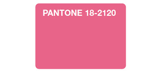
Once upon a time Pantone was something that behind-the-scenes people knew about. Their PMS (that's pantone matching system) color system was one that printers, designers, and anyone involved in precise color matching knew about. As graphics production and design folks, we had a long history of working with colors using that system.
Otherwise, who'd care?
In fact, a graphics designer asked just the other day what ever had happened to Pantone? Tom's answer ... fabrics, fashion, etc. ... was right as it turns out.
The very next day this story in the Wall Street Journal informed us that Pantone was busy answering that question as they revealed the new hue for 2011.
And more people cared than I'd ever have thought, as I was reminded when looking through Ten Thousand Place's list of cool stuff (it's a great list, by the way, you'll like it).
Me?
I was stunned to see that they even have a hotel. In Brussels. With a nifty, colorful website, of course.
I'd try it if I were ever going to be in Brussels. But in the meantime, for those of us without international traveling budgets, I thought these were cool.
I'm geeky that way. Though from the number available, I must not be the only one.


I'm not geeky that way. Or, more accurately, that way. I'd love a poster of XKCD's tic-tac-toe map. :-)
ReplyDeleteI think you have to have used the color system for over 30 years to have that sort of geek come over you.
ReplyDeleteAlthough I've played tic-tac-toe for much longer ... and that map didn't grab me. :-)
I love, Love, LOVE Pantone ... but I can't say that I <3 the 2011 choice of color.
ReplyDeleteI must say that I don't understand people that don't get *color*.
~~T
I read "pannetone", and was pretty excited. But I guess the color thing is cool too.
ReplyDeleteI used to work at a small press and bindery when I was in college, and we used Pantone inks -- that was the first I'd heard of them.
ReplyDeleteI don't really get off on that honeysuckle shade, but now I really want one of those mugs. In 337C.
I do actually like the honeysuckle shade ... though looking through the past Pantone colors what I don't understand is bright yellow for mimosa (from the WSJ article). Every mimosa blossom I've ever seen was a pinky-orange color.
ReplyDeletethe hotel is supposed to be fabulous, by the way. A friend went and visited it once. (She really is a color nerd). Thanks for the HT!
ReplyDelete